Fluvial — a transit patronage visualiser
My local public transit authority, TransLink, releases origin-destination patronage data.
I found myself wanting to visualise patronage flows for specific routes, and so I built Fluvial.
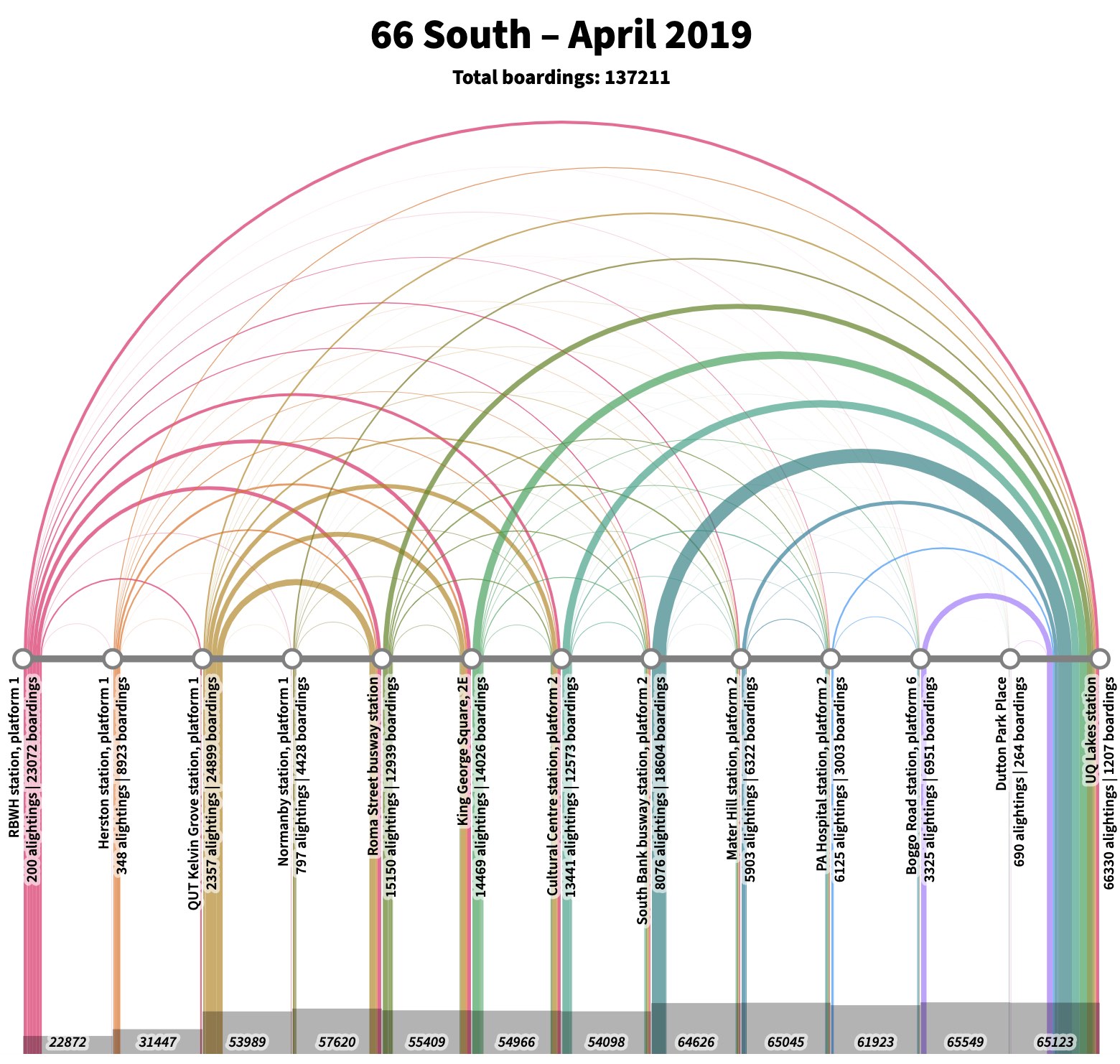
The tool generates “rainbow diagrams” — we have a line with stops running from left (start of the route) to right (end of the route). Arcs representing patronage flows swoop overhead. With appropriate colouration, the effect resembles a rainbow:
Browse the output
There are index pages linked below for each month, which in turn links to an SVG file for each route and direction. You may need to adjust the zoom level, or scroll around, especially for routes with many stops.
You can mouse over the arcs in the SVGs for a detailed description of the patronage flow.
Why “Fluvial”? Transit is like a river.
